 Jon Quixote
What does constructive criticism of a design change look like?
(Originally published on meta Stack Exchange by Jon Ericson.)
Last week we rolled out the new network theme to several sites. Some of these sites had beautiful designs previously and now have a less striking look. Unsurprisingly, the response to these changes has been somewhat very negative. Even before Joe posted our master plan back in March, this has been the stage I've dreaded. Nobody likes losing things and the new theme is a clear loss for the "Cadillac" sites. It doesn't help that some of the changes have revealed bugs in the framework. It really doesn't help that we are pushing forward even though many people strongly disliked aspects of the mockups.
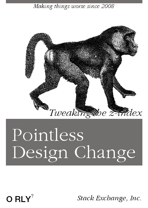
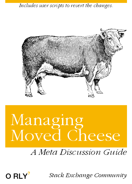
(Creating parody book covers has proved cathartic.)
I feel pretty strongly that insulting employees (particularly the designers who made the changes) is both counterproductive and morally wrong. Telling us we aren't listening seems unfair too. (A classic read on this subject is Kathy Sierra's "Listening to users considered harmful?".) Quitting the site over the new design seems extreme, but I respect people's values and recognize they aren't necessarily my own. Meanwhile, we appreciate detailed bug reports.
In between we see criticism with varying degrees of utility for us. For instance, we already know people don't like the new left bar. It's a central motivation for imposing the framework on sites and won't really prove it's worth until we are able to add features such as custom question list notifications to it. I personally am withholding judgement until it's on all sites so that I stop having to switch context when looking at another site.
I don't really know the best way to critique design changes, but I'd like to provide a few suggested criteria when answering announcements of new designs:
-
Avoid absolutes—"This is the worst design I've ever seen," might describe how you feel, but is demonstrably not true. (For clarity, I'm talking about BuzzFeed's design, but the 20 sites featured in the article are pretty bad too.)
-
Analyze the root problem—If you don't like some aspect of the design, try to answer the question "why?". Maybe the new color scheme doesn't work for color-blind or visually impaired folks. Or maybe they remind you of your alma mater's crosstown rival. Either way, explaining the real problem is more productive than "the colors suck".
-
Consider waiting a bit—How many times have you seen a website you use every day make some change to their UI that's really jarring but isn't a problem a week later? I really hate change, but it doesn't take me long to acclimate to it.
-
Try rephrasing rather than rehashing—We probably read the answer posted on another question, so there's no reason to repeat it verbatim. Meanwhile, rephrasing the criticism can often help. For instance, sometimes a CM will suggest a change to a design before we show it to meta, but the designers and developers go forward with their own idea. Once we show it to you, the community of users, the same issue (phrased in a new way) might come up and the design gets fixed based on that feedback. I'm not offended; I'm happy we can get the best design.
-
We're benevolent benevolent dictators—We've always been up front and forthcoming about new revenue streams especially when they drive major changes, and we try to communicate as far in advance of anything big as possible. That we don't decide to change course based on feedback isn't a symptom of not listening to it, but the animosity that this seems to create might be a symptom of us not communicating clearly enough. We'll try to do better, but please don't default to the worst scenario. It can mask sincerity and rob it of the consideration some complain we're not delivering. We're human, too, and very invested in this along with you, so 'jabs' certainly don't help and often honestly hurt. Jabs come in many forms, but implying that we're doing something for hidden reasons makes your feedback difficult to internalize or act upon.
Now might be a good time to say there are things I don't like about the designs myself:
- I think the left bar should be collapsible for users who don't like it.
- It's odd that arrow buttons and tags aren't customizable.
- I'd like to see a larger set of fonts available to sites.
- It's sad that really great designs (Judaism and Worldbuilding are two of my favorites) will be toned down and lose most of their character.
- Responsive design is nice, but it's not enough to make the changes worthwhile.
Now I trust Joe and his team to iterate on their work and make things better over time. (Though it's impossible to please everyone, of course.) And I'm excited for all the sites living with super generic designs that will get some level of customization. In the years to come, having a standard framework to aim for will allow us to roll out new features to the network with much less friction. So as much as I dislike the current state, I'm confident things will get better.
I understand if you don't see things the way I do. Over the years we've had a rough history of ignoring user feedback and leaving projects half-finished. The only way we can win back trust is to do better each day. You can help by providing actionable feedback.
Please direct comments to the original post.
 If you want to talk with me about community
management schedule
a meeting!
If you want to talk with me about community
management schedule
a meeting!