College Confidential’s costly theme
To preface: I joined College Confidential in January. The company I work for took over management of the site in December and implemented a new registration system to begin integrating with our other products. Last April the previous owner of the site implemented a new theme. The new theme has had a lot of benefits. Chief among them: the site now works on phones. But I believe the cost of the changes in terms of usability has been high. The good news is we can fix it.
Background
Using the Wayback Machine, we can see what the site looked like last year:
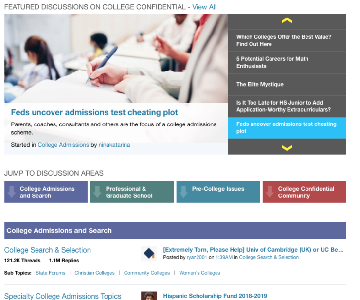
I’ve cropped out the topbar, sidebar and other navigation hints. This is the core experience of browsing our discussions. Here’s what that same general area looks like now:
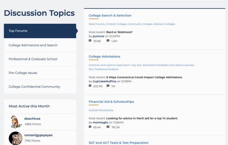
For this image, I’ve cropped out everything above the fold where we highlight content. The new theme allows that to take up far more space than the previous design. It also spends far less space on the discussion topics since it hides most of them behind a menu (“Top Forums”, “College Admissions and Search”, etc.). To summarize the effect: * The old design emphasized discussion topics. * The new design emphasizes specific articles or threads.
What we lost
Vanilla gives us a look back over the previous year1 in their dashboard:
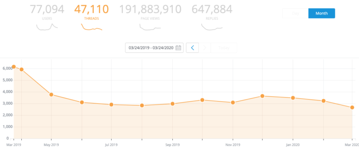
If you look at the greyed out graphs at the top of the image, you can see we haven’t lost much in terms of users. We always get a lot of new people in December and March. This year is no different. What is different is we aren’t seeing the usual increase in new threads. That means there are fewer than normal new replies, which means we have fewer pages for people to look at. That means fewer pageviews, which is the number we are tracking to meet our goals.
Now there are many possible reasons for this: * New theme * Registration changes in December * Competition from sites like Reddit and Niche * Changes in student behavior (maybe they don’t look to forums for guidance anymore?) * COVID-19 (but that only explains this month) * Aging2 community
I can’t (yet?) prove the design is the primary culprit, but I do see some evidence pointing in that direction.
DC Urban Moms (and Dads) don’t like our site
Brace yourself. Here are some quotes from a thread called What Happened to College Confidential?
- “Last year it was abuzz with college admission updates. This year, crickets. Where is everyone?”
- “Reddit”
- “It’s a ghost town and I have a senior this year so I had a reason to check out some specific college threads there and there’s just nothing but Chance Me’s.”
- “Niche”
- “I think it’s the update to the forums - the layout and design. I used to read there all the time but after the change I rarely visit.”
- “To make matters worse they decided to implement a new”sign in” procedure (Using your email address instead of your screen name) which for some reason has locked out many people…”
- “The clique of cat lady boomer moderators and serial posters drove everyone normal away.”
- “It’s very easy to get doxxed on there—and everything posted is permanently on Google.”
- “I did find some good information that helped DS craft his school specific essays on CC.”
- “I used it last year for some very specific information about going to school in the UK. There definitely were a few forum doyennes. However, they were generally helpful. What killed it for me was the redesign. It’s hard to find things now.”
- “New security updates sound like a ruse to more precisely data collect.3 Site is sketchy. It was really helpful like 15 years ago. Worthless now.”
- “I could deal with the over zealous moderators, but the visual mess is too much.”
- “I think some of the forums are useful, especially Athletic Recruiting, but I hate the new format. Things are so hard to find.”
- “I see posters getting”banned” and put in “time out” and always wonder what they did to get in trouble! I guess if you call someone out, you get banned.”
- “Yeah, the changes too CC are clear proof that website layout, design, and user-friendliness are essential. It seems so obvious, but some sites really get it wrong. I used to visit CC a fair amount a few years ago, and did learn quite a bit from it, but it’s SO hard to navigate now, and there’s so much wasted white space, it’s impossible to use anymore.”
- “It is very difficult to find anything on the site and a lot harder to track threads. There has been a lot of conversation about these difficulties on the parents forum, but you really have to know what you’re looking for in order to use the site. Which kind of defeats the purpose.”
- “I didn’t mind the update to the format, but now I can’t even sign in.”
- “My son got some very useful information on what was important for a college specific essay. It helped him craft it in a way that would appeal to admissions.”
- “I find that the people who hang out there ONLY hang out there. Once upon a time, it was like a pooling of resources. Maybe the redesign just drove away the people who were already on multiple sites doing research.”
- “When did that happen? I loved visiting it in 2017 and 2018, but find the new format so offputting that I rarely go there now. I did not have the negative experiences with forum moderators or posters others mention–all have been friendly and helpful. I imagine it depends which forums and threads you visit.”
- “But clearly the platform has been abandoned by many - for many reasons. Personally I found it impossible to navigate even before the redesign.”
- “CC is just completely unusable since the update.”
- “I wonder if they’ll revert back to the old version?”
That’s a lot, but the picture it paints is that it’s hard to find the useful information CC has because of the unfamiliar navigation system. Now to be clear, DCUM4 is the oldest of old-school forums. Of course people who post there are going to hate newer designs. But that’s a big part of our audience too. And it’s likely the audience who prefers the older design has been most active posting new threads too. (Plus the design is objectively bad as I will demonstrate momentarily.)
This anecdotal data also points to the other possible causes I mentioned previously. Perhaps the theme, as the most visible aspect of the site, is mentioned more often than other problems. Still, I don’t see anyone defending the design or the registration system. And we have fixed most of the problems people had registering, so it’s probably not as much an issue as it was in December when there were some problems. No, I’d say the problem is that we done messed up the design.
An aside about whitespace
I’ve seen a ton of user feedback about design changes and it’s almost universal that someone will complain about “wasted whitespace”. Sure enough: “Way too much whitespace when reading on my phone.” Designers seem to hear this criticism to mean something like:
I don’t like your design aesthetic.
And if that were what users meant, I’d agree we can totally ignore the criticism. But it’s not what they mean. Instead the internal dialog goes something like:
Hmmm… This site has changed. Looks like there’s more empty space on the page. Let’s see… where’d they put [feature]? Is it in the topbar? Nope. Sidebar? Not that I can see. You know it would fit pretty well in that empty spot. Why is it empty over there? I bet the designer likes Apple products. How is anyone supposed to know you can swipe down to get a menu? Honestly, I don’t understand why they don’t just use the space on the page instead of hiding everything.
In other word the designer hears “wasted whitespace” when the user is trying to say “wasted whitespace”. I assure you: users don’t care one way or another about whitespace if the site just works. It’s entirely possible to fix excess whitespace by adding more whitespace if it highlights a feature that users have overlooked.[citation needed]
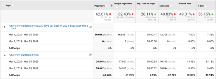
Case study: UC Irvine
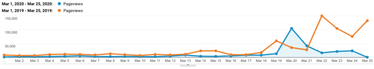
This is pageviews we’ve seen in the UC Irvine section of our forums according to Google Analytics. The spikes pretty much align with the influx of admission decisions from the school. In fact, we get a fair amount of of traffic from Google via searches such as “uc irvine decision”5 where we are the fourth result. The 2020 spike is smaller than the 2019 spike. But what’s more troubling is the 2020 spike is pretty much all the traffic we are getting. If I had to guess, it seems like people aren’t looking at other threads in the UCI topic. The analytics bear that out:
So you can see plenty of traffic in the class of 2024 discussion (which obviously didn’t exist in 2019). But the traffic to the UCI topic page disappeared. Again, there’s a UI reason for this:
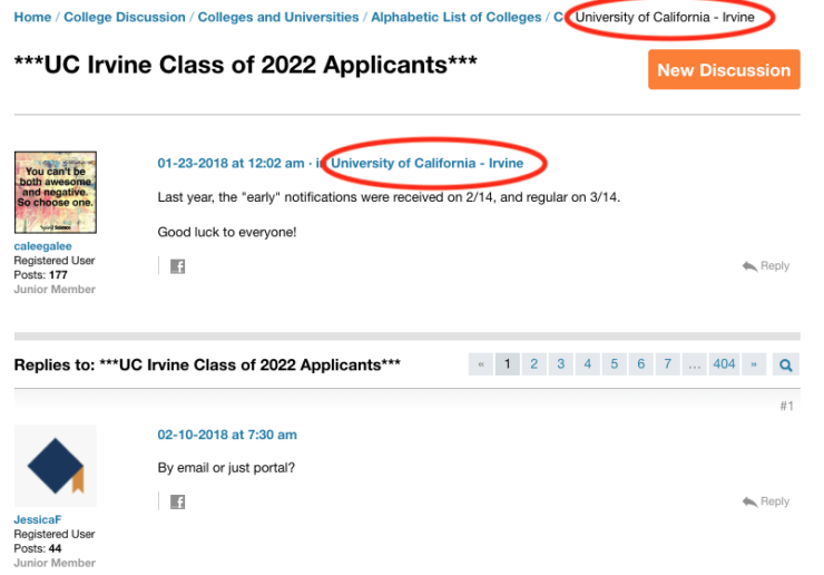
It’s relatively easy to find the topic the discussion is in and the hierarchy of the site. Maybe not as good as it could be, but it’s usable. Compare that to today’s view:
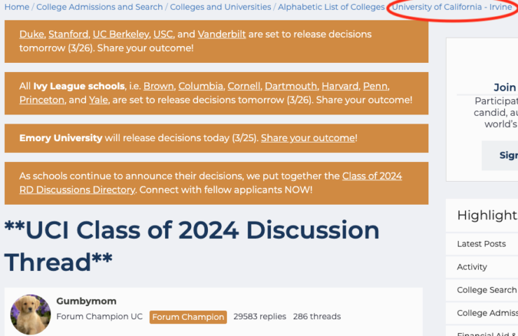
This is perhaps giving the new UI too much credit. The site is on the busy side and I didn’t notice the navigation the first few times I used the forums. On the other hand, the four orange banners are a temporary measure to help people find the schools that are releasing decisions right now. Later on the navigation will be closer to the post unless you have the video ad loaded:
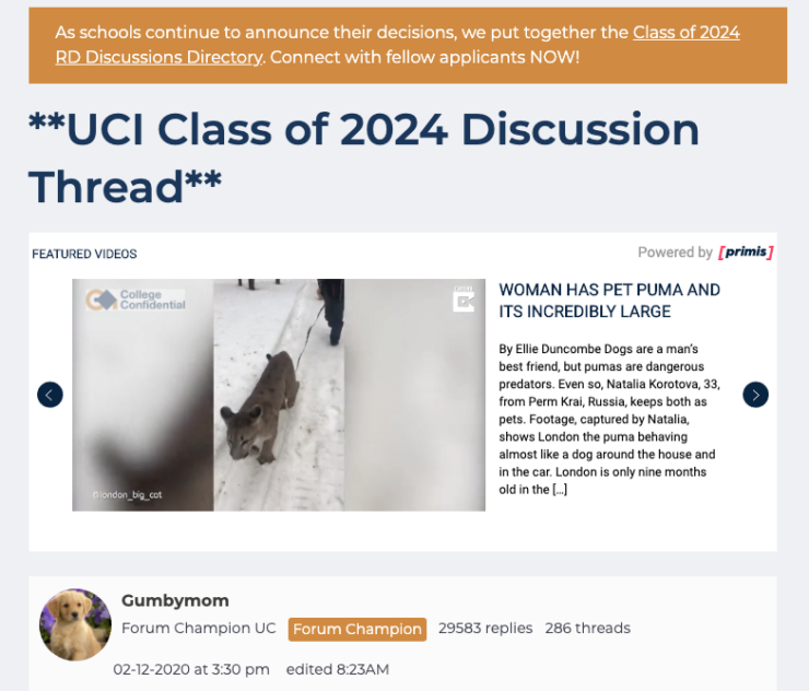
It’s possible I’m missing something, but that little set of links is the only way to browse to more UCI discussions. Also, for some reason, the current navigation excludes the “C” level where, for some reason, UCI is located. I clicked on the “Alphabetic List of Colleges” expecting Irvine to be under I or, failing that, U. C for California is probably the right place, but the new UI no longer gives that hint.
What can we do about this?
As much as I’m tempted to revert to the previous theme, that’s not an option we have. In addition to the technical problems, this would be a signal to our users that we’re not working toward solving their underlying problems. As one of my all-time favorite articles says:
True innovation will rarely come from what users say directly.
Yes the new theme isn’t working, but it can be made to work. We need to listen to what they are saying and dig deeper. Then we need to fix one problem after another until we have something that works.
Annoyingly, we can only see a year at a time. Whatever, Vanilla.↩︎
Actually, we prefer to call it “maturing”. ;-)↩︎
I believe this refers to the new registration system. And they are not wrong exactly. We have plans to use this data for good, but users don’t see that yet.↩︎
Really? That’s the acronym you want to go with?↩︎
Use the incognito mode (or equivalent) in your browser to avoid having Google serve up pages you visit frequently. Hopefully that includes CC.↩︎